


This is in part a continuation of B. D. Colen’s thought-inducing The Subject Is Black and White, dealing with the question that a color photograph may or may not distract from the subject. Without light — or wavelenghts for that — everything is black, right? Let’s assume every person sees black as is, as black. But what about white? And worse even: colors? Well no one really knows the answer because we all agree on the same name for things and values that we consider to be the same. But scientists say one person’s red can be another’s blue.
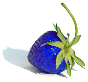
Research has led scientists to believe that people do not see all the same colors when they look at similar objects. Although there is a general consensus that red is the same shade as strawberries, blood and the planet Mars, some people could perceive the color red as another person’s blue. This assumption comes after an experiment with monkeys which suggests that the human color perception is shaped by the outside world but follows no predetermined pattern.
We don’t all see the same colors, that’s the scientists conclusion. The same should be valid for black and white, even though different shades of gray wouldn’t match the potential differences in the “perception” of colors.
Well color-blind people are a fact. They can’t tell red from green — and wouldn’t say a photo with green trees and red cars would look weird. It looks how it’s supposed to look. And how do we know that everyone’s red is everyone else’s red. It’s just be convention that we give names to things that we assume are one and the same.
We just all agree to call a certain set of wavelengths “green,” for instance. People may not see much variance with a basic color like fire engine red, but when you try it with colors that are harder to define — like sea foam green or french vanilla — you’ll inevitably discover that everyone’s perception of that color is slightly different.
Doubting this? You may want to read The Man Who Mistook His Wife for a Hat by Oliver Sacks to get some mind-blowing case studies on how strange the world can be for some people with sensory and/or perceptual disorders. Now don’t we all have some sort of disorders. Right, we’re perfect…
Again, neurons controlling color perception are not predetermined, but there is no way to tell how differently people see colors. Maybe it’s just different shades. Still, a rose is a rose, a strawberry a strawberry, even if everyone sees a rose and a strawberry differently.
And that’s the beauty of photography. It’s a universal language everyone understands — however different interpretations are. Colors depend on who you are.
Now what does this mean for color photography? Especially when working with reds and greens not everyone might see the outcome as you do. Add to this that the very exposure you select for your photograph greatly influences its color and its mental effect. A mere plus or minus of just 1/3 stop can radically change everything!
It’s not easy but really important to really be aware of the psychology of colors and how they affect our perception and the responses they evoke inside of us.
You might really see blood as the color someone else calls blue, and the sky as someone else’s red. But our individual perceptions don’t affect the way the color of blood — or that of the sky — make us feel. And that’s when color photography is at its best: by being evocative to capture the essence of the human struggle and joy.