


The often ignored histogram can be one of the most useful tools in digital photography to achieve perfect, balanced exposure. It’s also one of the least understood tools. The standard histogram plots the brightness (or luminosity) of every pixel in the picture and is measured on a 256-step scale, that’s the number of permutations available in a JPEG image.
Even basic cameras have it: the histogram. Choose the LCD’s according display mode — and most cameras even give the option to see the RGB histogram for each separate color channel. Why any photographer should use this simple tool that analyzes an image based on mathematical algorithms? Because the histogram helps to get the better exposure.
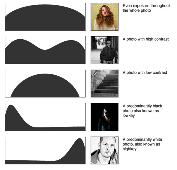
An image histogram is a type of histogram that acts as a graphical representation of the tonal distribution in a digital image. It plots the number of pixels for each tonal value. By looking at the histogram for a specific image a viewer will be able to judge the entire tonal distribution at a glance.
Writes Luminous Landscape:
Not too long ago a histogram was something mysterious. Today it has become a valuable tool for the photographer who wants to gain mastery of their digital camera’s image quality. Start using the histogram review feature of your digital camera. Set your camera to display a combined thumbnail and histogram for 5 to 10 seconds after every frame. Get in the habit of glancing at it. It’s the greatest invention since the built-in light meter.

Gray? Even color photographs must first have the exposure and contrast set right. Same goes for black and white, and only then should you worry about the color balance.
There is no “ideal” or “perfect” histogram. Photographs are as manifold as life itself. As a rule of thumb: the darkest tone available is zero, and shown at the left side of the graph. The lightest, whitest tone achievable is 255 on the scale — and is shown on the extreme right of the graph.
To get the best tonal range, and to avoid problems with underexposed shadows or overexposed highlights, the histogram should be vaguely bell-shaped. That is, the graph should drop down to baseline towards both left-hand and right-hand extremes.
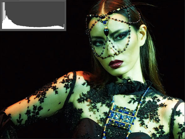
In digital photography, you prefer underexposure over overexposure. The latter is difficult if not impossible to correct. So you’ll want an image histogram that is stacked to the left which will make editing much easier than one that is squeezed up tight to the right.
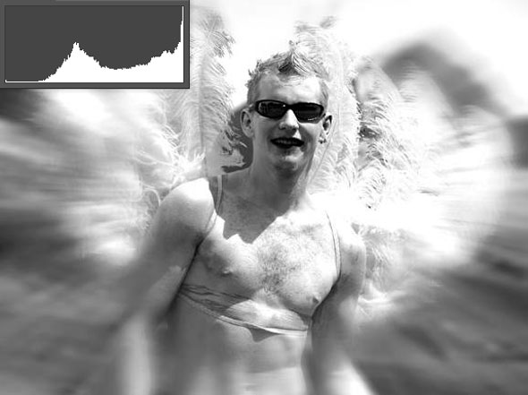
As you overexpose, the graph moves further to the right and eventually clips as your image destroys itself. Overexposed digital images are almost useless. Anything that washes out to white is gone forever. So watch out for spikes on the graph’s right side.
And you’ll want that parts of the images to be clipped, for the simple reason because they should be shown as pure white or pure black. But then again, keep an eye out for histograms with dramatic spikes to the extreme ends of either side of the spectrum. This indicates that you have a lot of pixels that are either pure black or pure white.
To summarize:
- High contrast gives a graph squashed up on the right with highlights clipped.
- Low contrast images with no highlights or shadows are “black” on the left and right due to no dark shadows and no bright highlights.
- White background images with little visible shadow values peak on the right. Dark scenes mean that the graph will peak on the left.
Most well exposed shots tend to peak somewhere in the middle and taper off towards the edges.
Still, in the end photography is hardly about mathematics, curves and graphs. To conclude with Luminous Landscape:
With the possible exception of showing badly blown out highlights there really is no such thing as a bad histogram. They just are.